Case study —Accommi.ai

THE CONTEXT

Steve, the founder of Accom.ai, encountered a problem when booking accommodation for his getaway to Ocean city Maryland with his partner. He noticed a lack of relevant and supportive information, as well as controls to help him refine his search for accommodations that met his specific needs and preferences.

ROLE

UX/UI Design, UX Research, User Testing

TOOLS

Figma, Fig Jam, Google, Google sheet, Typeform, Calendly, Whimsical, Zoom and Zeplin.

Doris Agusiobo

Case study —Accommi.ai

THE PROBLEM

Many accommodation booking platforms in the U.S. lack comprehensive tools and information, leading 80% of users to experience difficulties in making informed decisions about their stays.

As a result, travellers end up spending more time than anticipated during the process. In certain cases, they realise that their chosen accommodation is inconveniently located, situated in unsafe areas, or they are unaware of local activities due to the absence of supportive information.

Doris Agusiobo

Case study —Accommi.ai

THE OBJECTIVE

Accom.ai is looking to launch a well designed accommodation booking platform to help travelling couples (with kids) find the perfect and personalised accommodation for their getaway. Based on our research, 60%  of our participants reported they would like to see a platform that helps them research for activities and accommodation together, so they can find the perfect accommodation.

We believe that, if we solve this problem effectively, we will be able to reach 500 booking by the end of 2024.

Doris Agusiobo

  • 1. EMPATHISE
  • 2. CONCEPTUALISE
  • 3. DESIGN

Case study —Accommi.ai

1. EMPATHISE

2

3

Lack of control on refining the search for the ‘perfect’ accommodation.

  • Current frustrations and pain points?
  • What did they really want?
  • What did they really need?

Doris Agusiobo

Case study —Accommi.ai

1. EMPATHISE

2

3

Dived into an intensive 2-week research sprint.

  • 10+ user interviews
  • Investigated forums, reddit and FB groups
  • Mapped out a competitor and SWOT analysis

Doris Agusiobo

User interviews

Interesting takeaway
  • Travelling couples want a better booking experience, where they can really refine their searches to find the perfect accommodation.
  • Travellers have unique and different expectations and preferences for booking accomodation.
  • Travellers prioritise there nonnegotiable when booking an accommodation.
  • 1. EMPATHISE
  • 2. CONCEPTUALISE
  • 3. DESIGN

Case study —Accommi.ai

1

2. CONCEPTUALISE

3

Overwhelmed with insights, we needed to start prioritizing to form a strategy.

  • Understand key painpoints, wants and needs
  • Classify all insights gathered
  • Present our synthesis to stakeholders

Doris Agusiobo

Affinity map

Interesting takeaway
  • There is always a motivation behind people    wanting to go on a holiday. The different intents, lead to different expectations throughout the trip.
  • Travellers prioritise key factors such as affordability, basic amenities, accessibility, convenience, and security when planning a trip, which are crucial insights for shaping our strategy.
  • People remember the peak, low, and end moments of an experience most vividly, so our goal should be to ensure every stay ends on a positive note.

Customer journey map

Interesting takeaway
  • Complex Decision-Making: The journey involves balancing budget, preferences, and availability, leading to extensive back-and-forth decisions.
  • Emotional Rollercoaster: Customers experience a range of emotions, from excitement and confidence to frustration due to budget limits and misrepresented options.
  • Pain Points and Improvement Needs: Challenges include managing multiple tools, choice paralysis, and property misrepresentation. Customers seek a streamlined, visual process, authentic reviews, and flexibility in booking terms.

Key takeaways

  • Ensure a seamless and transparent journey from planning to arrival, with precise and reliable information.
  • Maintain clear and consistent communication to prevent misunderstandings and frustration.
  • Provide flexible options that accommodate varying needs, budgets, and preferences.
  • Address key pain points like choice paralysis, misrepresentation, and fragmented research to enhance satisfaction and booking confidence.
  • 1. EMPATHISE
  • 2. CONCEPTUALISE
  • 3. DESIGN

Case study —Accommi.ai

1

2

3. DESIGN

We were on a very tight deadline and developers needed to start building soon.

  • Should we design mobile first?
  • Did we need a design system right now?
  • What was our visual design language?

Doris Agusiobo

Case study —Accommi.ai

1

2

3. DESIGN

Once we answered the burning questions, we commenced design right away.
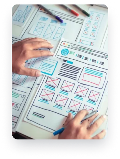
  • Built a design system as a priority
  • Moved forward with a mobile-first approach
  • Focus on homepage and funnel first

Doris Agusiobo

Design system

Interesting takeaway
  • Built a design system to centralizes and organizes all product-related knowledge, ensuring consistency in design.
  • It helps maintain a unified visual language across teams, reducing redundancy.
  • It accelerates development by providing reusable components and clear guidelines.

Overall flow highlights

  • Search Process Initiation: The user starts on the homepage and makes a search by specifying details like the destination, start and end dates, and the number of guests. This step is validated before proceeding.
  • Filtering and Sorting: After the search is validated, the user is directed to the search results page, where they can apply various filters (occasion, price, style, amenities, etc.) to refine their search results.
  • Booking and Confirmation: Once a specific result is chosen (either through a dedicated details overlay or page), the user proceeds to make a booking, followed by validation, and finally reaches the checkout page to complete the booking. The journey concludes with the "My Booking" confirmation.

Key Page Wireframes

Interesting takeaway
  • Wireframes serve as the blueprint for my design, outlining the structure and layout of each screen which helped me to visualise the overall user interface and ensure that the layout is intuitive and easy to navigate.
  • It helped me to focus on functionality and usability rather than aesthetics, allowing me to iterate quickly and make changes to the layout
  • View Wireframe: https://whimsical.com/accom-ai-9q2GSExjx3HQQ9R6By5hPf

Overall design highlights

  • The booking platform's design focuses on a user-centric flow, streamlining search, filtering, and booking processes.
  • It features intuitive navigation, guided decision-making, and validation checkpoints to ensure accuracy and ease of use throughout.
  • The design incorporates a responsive grid layout, ensuring optimal adaptability across all screen sizes.
  • View project:https://www.figma.com/
    design/6yOuxgl M0uHb0BW0FhX5Hk/Solutions---Module-9---UI-Designs nodeid=603387&t= vuqFZNpJdTr8kzMq-1
OUTCOMES

We successfully launched
3 months later and celebrated
at a roof top bar with the entire
Company A team!

  • The average daily rate increased by 10% in
    the second quarter of the year compared
    to first quarter

LET'S TALK

duchess.doris@gmail.com
Doris

Follow Me

-